The 2026 interior design trends move in one direction. Rooms are becoming warmer, quieter, and more tactile.
The cool grays and high-gloss finishes that shaped the last decade of interiors are on their way out. What replaces them is a preference for materials that show their own grain, weave, and variation.
This guide covers what is changing, why it is changing, and how to bring natural texture into a room without starting over.
The Shift Behind the 2026 Interior Design Trends
For most of the last decade, minimalism was an exercise in subtraction: white walls, cool gray floors, sharp edges, and sparse furnishings. Today, warm minimalism has taken over—retaining that same spatial restraint, but building warmth through natural materials, soft neutrals, and layered textures instead of empty surfaces.
Pantone set the tone when it named Cloud Dancer, a soft off-white, as its Color of the Year, the first white shade ever chosen. Selected as a counterweight to visual noise, this quiet base layer sits comfortably alongside timber, stone, and natural fibers.
When your anchor color is a soft off-white, a room’s character no longer comes from paint; it comes from material depth and tactile quality.
Warm neutrals as the new base layer.
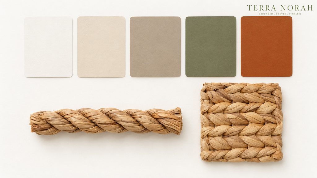
The color story this year is warm, grounded and earth-derived. Designers are specifying oat, wheat, sand, caramel, greige and clay, with terracotta returning as an accent rather than a full wall and muted greens holding their position from previous seasons. Cool gray, which dominated from roughly 2015 onward, has largely left the palette.
The reasoning is practical rather than aesthetic. Warm neutrals sit correctly beside natural materials, whereas a cool gray wall tends to make woven fiber look dull and faintly yellow. The same basket against a warm neutral wall reads as deliberate.
A workable structure for a warm neutral color palette in 2026:
- An off-white for walls and other large surfaces
- A mid-tone earth neutral for textiles, storage and soft furnishings
- One deeper accent, held to no more than three objects in a room
Natural texture as structure, not decoration.
This is the part most trend round-ups get wrong. Texture in 2026 is not something added at the end of a scheme; it is the element that keeps a neutral room from collapsing into beige. Strip the woven, the linen and the visible grain out of a warm neutral space and very little is left holding it together.
Natural texture home decor works best as a layering exercise, with three material families in a room and no more:
- A hard grain. Timber, matte ceramic or unpolished stone.
- A soft weave. Linen, wool or a flatweave floor covering.
- A structured fiber. Woven storage baskets, trays and organizers.
The third layer is the one most rooms are missing, and it behaves differently from the other two. Soft textiles absorb light and hard surfaces reflect it, while a woven body does neither cleanly, which is why a basket adds a kind of depth that another throw blanket cannot.
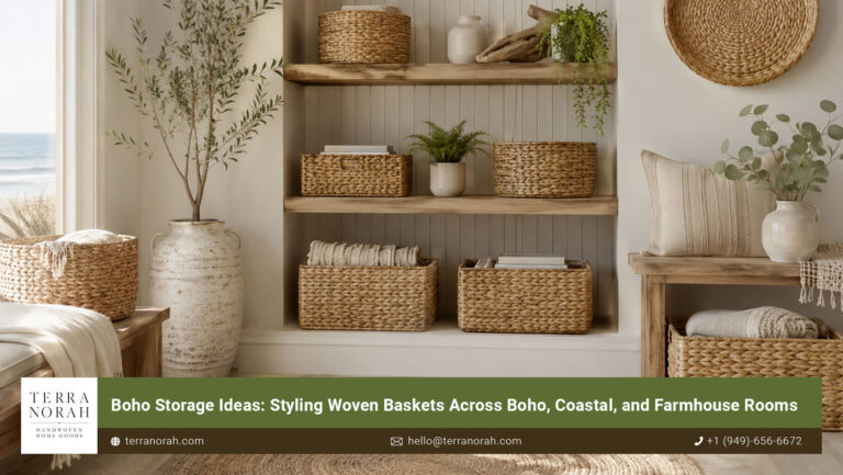
Scale decides whether that layer lands. A single small basket on a wide shelf tends to disappear, whereas two pieces at different heights placed together read as a deliberate group rather than leftover storage.
Curved form and the visible hand.
Running alongside the color shift is a softening of geometry: rounded arms, arched openings, sculptural silhouettes and noticeably fewer hard corners.
Woven fiber belongs to this trend by construction, since a basket is shaped by hand around a form and its edges are never mechanically straight. Two pieces from the same batch will differ slightly in curve and in tone, and that variation, which manufacturing spent years trying to eliminate, is now the reason people buy the object. Textured decor ideas built on machine-perfect repetition read flat next to it.
Handwoven water hyacinth in the 2026 palette.
Water hyacinth is a river plant, cut and sun-dried before it is hand-twisted into cord and woven. The drying stage is what makes it relevant to this year’s palette: it produces a natural tonal range running from pale sand through honey to deep bronze, landing inside the warm neutral band without dye. The finish stays matte, so it holds its place beside an off-white wall instead of bouncing light back at it.
The weave sets the register. A tight fishbone reads structured and quiet; an open twill reads relaxed. Both belong to organic modern interior design, and the choice matters more than the color does.
We weave every piece on our own production floor in Bà Rịa Vũng Tàu, drawing on Mekong Delta weaving traditions, and export it under our direct management. There is no reseller between the river and the room, which is why we can speak to how a piece was dried and shaped rather than only to how it looks on a shelf.
Room by room application.
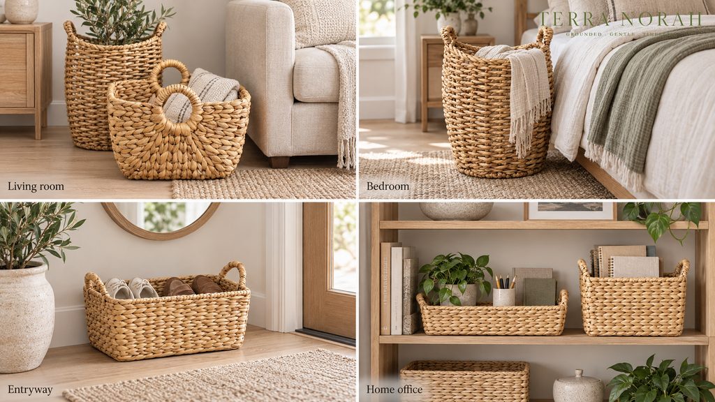
Living room.
Two woven baskets beside a sofa, one for throws and one for media, with a low tray on the coffee table to group loose objects into a single mass. Keep the walls off-white and let the fiber carry the warmth.
Bedroom.
Warm neutral linen, a wool floor covering and one tall basket at the foot of the bed. It is the clearest expression of warm minimalism in the house: three materials, one palette, and nothing decorative that does not also hold something.
Entryway.
The highest-return placement in a home. A single structured basket for shoes or bags gives a small space a defined edge, and natural fiber home accessories work here because they absorb visual noise rather than adding to it.
Home office.
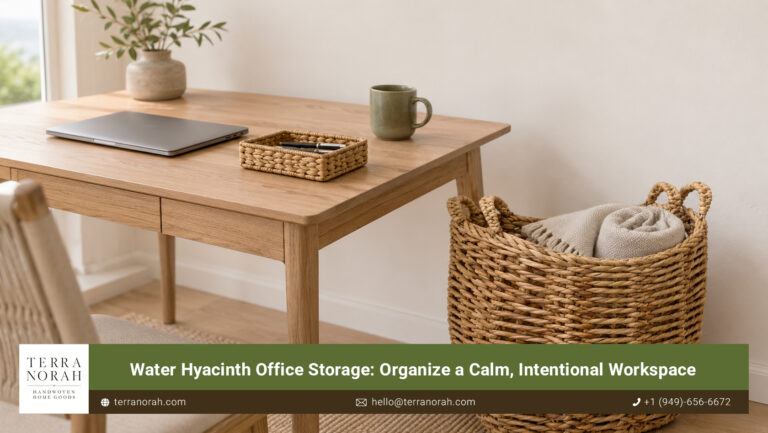
Desktop organizers and shelf storage drawn from the same fiber family will unify a wall of mixed objects. Books, cables and files stop competing once they sit inside one consistent material.
Why natural fiber outlasts the trend cycle.
A woven basket kept dusted and out of standing water will still be in use long after the palette around it has changed, which is the practical argument for natural material over printed finish. Sustainable home decor has been making that case for years, and 2026 is the year the aesthetic finally agrees with it.
What the year is actually asking for.
The 2026 interior design trends are not a shopping list. Read together with Terra Norah, they point toward rooms built from fewer and better materials, where three well-chosen surfaces produce more calm than nine competing ones, and where a piece that holds something earns its place more easily than an ornament that does not.
Texture, chosen once and chosen properly, does the work that six accent pieces cannot.